

The WCA is less generous than the OBR thinks
The WCA is less generous than the OBR thinks
It's simply not true that more people are being awarded incapacity benefits than there used to be

This post has been updated in ‘More on the OBR and the WCA’ - please do not rely on the post below without also reading the later post!
In the coming weeks, I will release a report called ‘After the WCA: Competing visions of disability and welfare’, which discusses different scenarios for the future welfare system. But before this comes out, I just wanted to blog about two key charts from the report, which I think are essential for understanding the situation we’re now in - starting with this one.
Is the Work Capability Assessment1 more generous than it used to be? According to the OBR, the answer is ‘yes’ – we are seeing far more ESA/UC claimants being awarded higher levels of benefits than we used to.
But these figures are wrong, and the true figures show something quite different. This short blog post has one aim – to explain what the OBR’s mistake is, and show you what the true figures are.
Where the OBR went wrong
The OBR – the Office for Budget Responsibility – do a great job of transparently and independently forecasting government expenditure. They’ve focused quite a bit on disability/incapacity benefits expenditure, and their analyses are always revealing (not least because they sometimes get DWP to provide new data). I’ve chatted to them a couple of times about disability/incapacity benefits over the years; they always seem an impressive and dedicated group of people.
Nevertheless, I think they made an error in their 2023 Fiscal Risks & Sustainability report. The error is in Chart 2.12, which shows WCA onflows and approval rates – I’ve duplicated it below. It’s a pretty confusing chart to read, but it shows (i) that the number of people that the WCA classifies as having ‘more severe incapacity’ in the latest quarter is 120,000/quarter, by some way the highest on record (the dark green shaded area / left-hand axis), and (ii) the ‘health condition approval rate’2 is now 80%, which is higher than any point before mid-2019 (yellow line/right-hand axis).
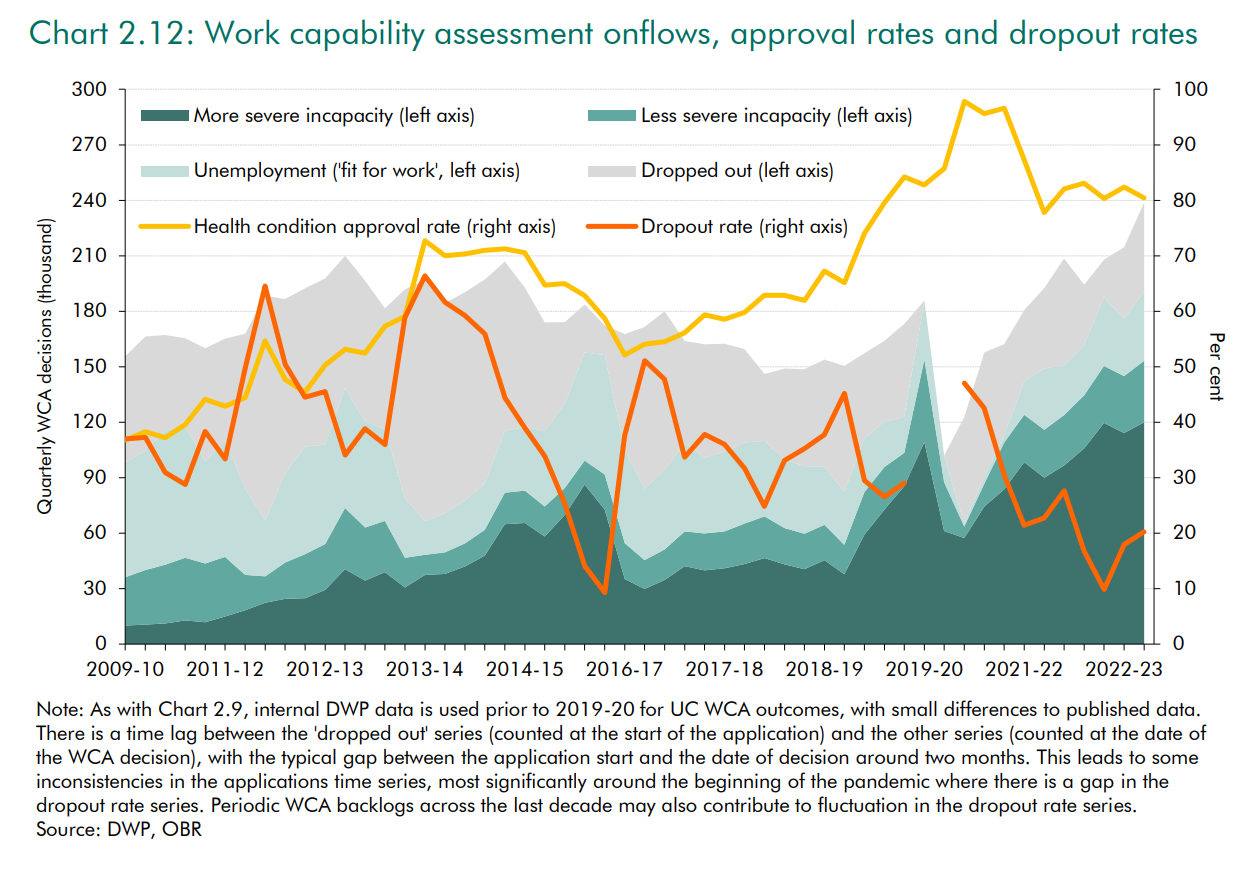
These claims have been widely circulated by the widely-respected Institute of Fiscal Studies, and just as I was writing this blog, it was repeated by a widely-respected panelist in a Resolution Foundation event.3
The problem, though, is that this combines pre-UC figures that mean one thing, with post-UC figures that mean something quite different. More specifically:
The pre-UC figures focus on ‘initial assessments’ – that is, the first WCA that someone goes through.
In contrast, the post-UC figures focus on ‘all assessments’ – most longer-term claimants of UC/ESA have to go through WCAs reasonably regularly, and the post-UC figures include these.
This completely skews the figures. This is partly because the absolute number of assessments obviously goes up when you’re counting more types of assessments. But it also skews the WCA ‘health condition approval rate’, which is higher for reassessments than initial assessments – unsurprisingly, people that have previously been granted the higher level of benefit are more likely to be granted it again, compared to people that have never previously applied.
Just to be clear – I’m really sympathetic to the OBR in how this mistake arose. The figures on the WCA are split across several different data sources that are tricky to understand, and the DWP should really collate these into a single dataset that is much easier for people to use. (Moreover, I didn’t spot this error at the time, despite reading the report in detail, and it took me quite a while to figure out the issue and create the revised figures below ). But still: the figures are wrong.
What the real WCA figures look like
The DWP don’t (yet) supply figures for WCA initial assessments under UC. So to look at the WCA in a consistent way over time, we have to look at all assessments (including repeat assessments).4 We also need to take into account a policy change that happened in 2017, so that people who are classified as only having less severe limitations (WRAG/LCW) are no longer entitled to any extra money unless they have transitional protections (they just have slightly weaker conditionality requirements).5 The approval rate using a consistent series looks like this:
This clearly shows that the WCA now is no more generous than 2013.
Slightly more people are categorised as having ‘more severe limitations’ than a relatively brief period in 2016-18 – but people newly categorised as having only ‘some limitations’ stopped receiving extra payments in 2017. The system seems to have adjusted so that slightly more people were classified as having ‘more severe limitations’ after this point, as I predicted at the time.6
The recent figures may also be skewed upwards because some UC claimants who submit fit notes are not being referred to WCAs (more on this in my upcoming report). But even so, 63% of WCAs in 2023 qualified people for additional incapacity-related payments, which (excluding LCW/WRAG claimants after 2017) is similar/lower than every year since 2014, other than a short period after the WCA change – which is hardly a system suddenly running out-of-control.
It’s also useful to look at the absolute numbers of people receiving incapacity related payments via the WCA, which is the most common use of the OBR figures. We can compare the corrected figures to the original OBR figures in the chart below:
The picture that the OBR paint is one of sharply rising numbers of people receiving incapacity-related payments via the WCA - there’s a spike just before Covid, then a fall at the start of Covid, before a recent rise back up to record levels.
But when we produce a consistent series, we see that the current figures are in fact relatively low. Excluding people who are categorised as LCW/WRAG who don’t actually receive any more money than non-incapacitated claimants, the current level (124k) is lower than every quarter from Nov 2011 to Covid.
What does this mean?
It’s reasonable to ask, “does this mean that the OBR forecasts for incapacity benefits are too high?” But the only answer I can give at this stage is, “I don’t know.”
This is partly because we might be particularly interested in the figures for initial WCA assessments (‘new incapacity claimants’), and we don’t yet have these for UC. So maybe the figures for initial WCA assessments show a different picture than the one above - I’d be surprised, but it’s not 100% impossible.
[Important extra note: this might actually show something slightly different, because the balance of initial vs. repeat assessments changes substantially over time, and this will bias the combined figures slightly (added 21/6/2024 in response to a reader email)]
But it’s primarily because it’s very hard to know what the OBR bases its forecasts on:
If they’re basing it on these WCA figures, then yes, their forecasts are likely to be too high.
If they’re basing it on caseload numbers, then I’ve previously blogged about how these might be wrong for different reasons.
But if they’re basing it on DWP spending figures, then the forecasts should be immune from these issues.
I’ve flagged this to the OBR, and I’d guess that this will taken into account in their upcoming Welfare Trends Report. But whatever the impact on the forecasts, it’s crucial that we stop saying ‘incapacity benefit onflows have skyrocketed’ based on this data. I’m sympathetic to the OBR and others who have said this, because the figures are a mess - but still: these numbers are wrong, and are giving a misleading picture of what has been happening.
The Work Capability Assessment is the health/disability assessment that governs whether Universal Credit (UC) claimants (and claimants on the legacy benefit ESA that pre-dates UC) receive additional benefit payments on the grounds that they are less likely to work (technically known as the Limited Capability for Work-Related Activity group), and are exempt from conditionality. Because I’m guessing most people who read this blog will know about the WCA, I haven’t explained it in the main text.
I don’t like the term ‘health condition approval rate’, but just to avoid confusing matters further, I’ve stuck with the term that the OBR use.
The person saying this was one of my favourite academics, Paul Gregg, at this event (which I’ll say more about in my next post). The video isn’t available, but Paul said something like ‘the onflow onto incapacity benefits has doubled from about 20,000/month to 40,000/month. I don’t blame Paul for repeating it - this is the way the statistic is presented by the IFS, who in turn not unreasonably assumed that the OBR figures were correct.
While I can replicate the OBR numbers for initial assessments until Feb 2017, for some reason the OBR numbers for May 2017 onwards are greater than the official statistics that I can find. The difference is relatively small, except for Aug 2018 to May 2019. [ADDED 15:24: Someone who read this blog suggested that this the gap probably comes from UC WCAs before the DWP publish figures (which OBR might have access to). This seems a reasonable interpretation to me too].
ESA claimants who were already in the WRAG group before 3 April 2017 will continue to receive it after this point (including if they move to UC) - see https://researchbriefings.files.parliament.uk/documents/CBP-7649/CBP-7649.pdf . Stat-Xplore data shows that 23k households currently receive the LCW payment on UC; and there are 150k still in the ESA WRAG group. The data do not confirm that all of these people still receive the Work-Related Activity Component via transitional protection, but it is likely that many of them do.
I wasn’t very specific on this - I said, “If the WRAG/Support Group distinction is made even sharper, then claimants, their GPs, Maximus assessors, and DWP decision-makers may be ever-more likely to say that there is a health risk to placing someone in the WRAG. The net result would be that people who might otherwise be placed in the WRAG are instead placed in the Support Group”. It is not clear if this happened because the assessors changed their practice, or claimants changed their behaviour.
One further thing to add - it's interesting to look at the OBR forecasts in the "Spring Statement 2024 Expenditure and Caseload forecasts".
The 2023/24 figures are still technically OBR forecasts in Spring 2024, but these show that incapacity benefits spending is rising in 2023/24, back to the levels of 2020/21. This is a new trend if it's borne out, as incapacity benefits spending actually went down 2020/1 to 2022/3.
The OBR are then forecasting a slightly larger year-on-year rise to 2024/25, then a smaller rise to 2025/26, and then spending flatlines as a share of GDP. (Which itself suggests a rising caseload if they’re still assuming existing benefits uprating policy continues).